
Learn CSS
CSS Selectors
Learn CSS So That Your Site Doesn't Look Like Garbage
CSS Selectors
CSS Selector: Applies styles to a specific DOM element(s), there are various types:Type Selectors: Matches by node name.Class Selectors: Matches by class name.ID Selectors: Matches by ID name.Universal Selectors: Selects all HTML elements on a page.Attribute Selectors: Matches elements based on the prescence or value of a given attribute. (i.e. a[title] will match all a elements with a title attribute)
/* Type selector */
div {
  background-color: #000000;
}/* Class selector */
.active {
  color: #ffffff;
}/* ID selector */
#list-1 {
  border: 1px solid gray;
}/* Universal selector */
* {
  padding: 10px;
}/* Attribute selector */
a[title] {
  font-size: 2em;
}
Class Selectors
- Used to select all elements of a certain class denoted with a
.[class name] - You can assign multiple classes to a DOM element by separating them with a space.
Compound Class Selectors
- To get around accidentally selecting elements with multiple classes beyond what we want to grab we can chain dots.
- TO use a compound class selector just append the classes together when referencing them in the CSS.
<div class="box yellow">- i.e. .box.yellow will select only the first element.
- KEEP IN MIND that if you do include a space it will make the selector into a descendant selector.
h1#heading,
h2.subheading {
  font-style: italic;
}- When we want to target all
h1tags with the id ofheading.
CSS Combinators
- CSS Combinators are used to combine other selectors into more complex or targeted selectors — they are very powerful!
- Be careful not to use too many of them as they will make your CSS far too complex.
Descendant Selectors- Separated by a space.
- Selects all descendants of a parent container.
Direct Child Selectors- Indicated with a
>. - Different from descendants because it only affects the direct children of an element.
.menu > .is-active { background-color: #ffe0b2; }<body> <div class="menu"> <div class="is-active">Belka</div> <div> <div class="is-active">Strelka</div> </div> </div> </body> <div class="is-active"> Laika </div> </body>- Belka would be the only element selected.
Adjacent Sibling Selectors- Uses the
+symbol. - Used for elements that directly follow one another and who both have the same parent.
h1 + h2 { font-style: italic; } <h1>Big header</h1> <h2>This one is styled because it is directly adjacent to the H1</h2> <h2>This one is NOT styled because there is no H1 right before it</h2>
Pseudo-Classes
Pseudo-Class: Specifies a special state of the seleted element(s) and does not refer to any elements or attributes contained in the DOM.- Format is a
Selector:Pseudo-Class NameorA:B a:hover { font-family: "Roboto Condensed", sans-serif; color: #4fc3f7; text-decoration: none; border-bottom: 2px solid #4fc3f7; }- Some common pseudo-classes that are frequently used are:
active: 'push down', when ele are activated.checked: applies to things like radio buttons or checkbox inputs.disabled: any disabled element.first-child: first element in a group of children/siblings.focus: elements that have current focus.hover: elements that have cursor hovering over it.invalid: any form elements in an invalid state from client-side form validation.last-child: last element in a group of children/siblings.not(selector): elements that do not match the provided selector.required: form elements that are required.valid: form elements in a valid state.visited: anchor tags of whih the user has already been to the URL that the href points to.
Pseudo-Selectors
- Used to create pseudo-elements as children of the elements to which the property applies.
::after::before
<style>
  p::before {
    background-color: lightblue;
    border-right: 4px solid violet;
    content: ":-) ";
    margin-right: 4px;
    padding-left: 4px;
  }
</style>
<p>This is the first paragraph</p>
<p>This is the second paragraph</p>
<p>This is the third paragraph</p>- Will add some blue smiley faces before the p tag elements.
CSS Rules
CSS Rule: Collection of single or compound selectors, a curly brace, zero or more propertiesCSS Rule Specificity: Sometimes CSS rules will contain multiple elements and may have overlapping properties rules for those same elements - there is an algorithm in CSS that calculates which rule takes precedence.The Four Number Calculation: listed in increasing order of importance.
Who has the most IDs? If no one, continue.
Who has the most classes? If no one, continue.
Who has the most tags? If no one, continue.
Last Read in the browser wins.

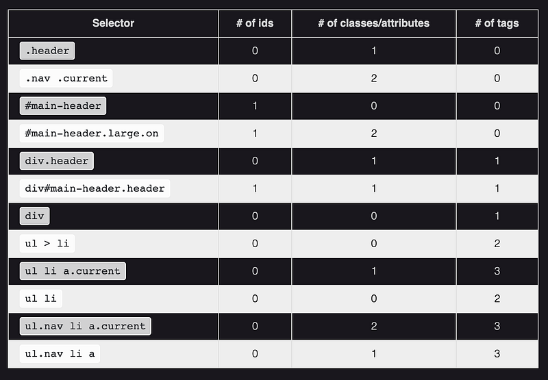


- Coming back to our example where all the CSS Rules have tied, the last step 4 wins out so our element will have a
purple border.
CSS: Type, Properties, and Imports
Typography
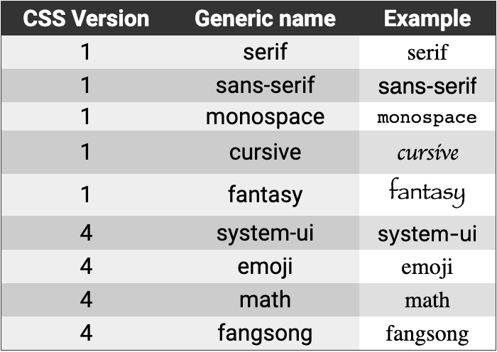
font-family: change the font.

Background-Images
- You can use the background-image property to set a background image for an element.
CSS: Colors, Borders, and Shadows
Colors
- You can set colors in CSS in three popular ways: by name, by hexadecimal RGB value, and by their decimal RGB value.
- rgba() is used to make an rbg value more transparent, the
ais used to specify thealpha channel. - Color : Property used to change the color of text.
- Background-Color : Property to change the backgrounf color of an element.
Borders
- Borders take three values: The width of the border, the style (i.e. solid, dotted, dashed), color of the border.
Shadows
- There are two kinds of shadows in CSS:
box shadowsandtext shadows. - Box refers to HTML elements.
- Text refers to text.
- Shadows take values such as, the horizontal & vertical offsets of the shadow, the blur radius of the shadow, the spread radius, and of course the colors.
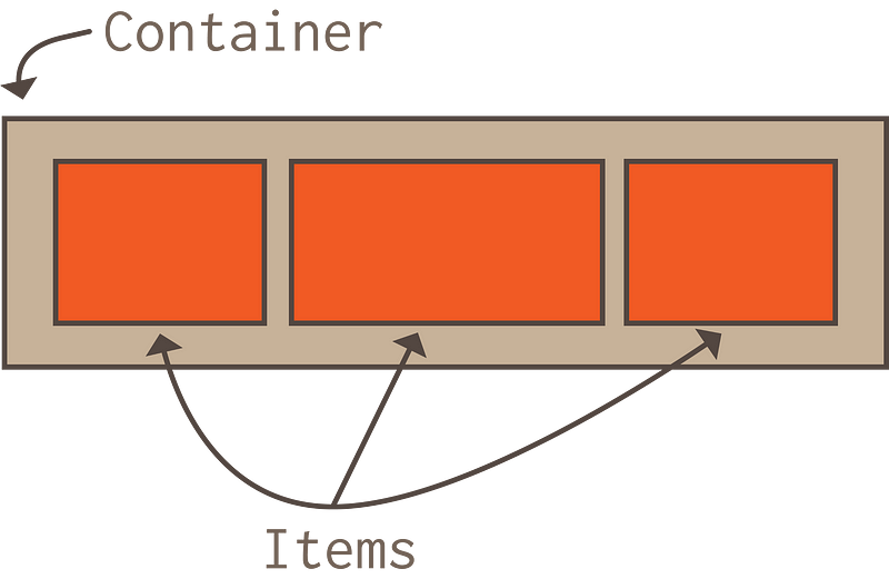
The Box Model
Box Model : A concept that basically boils down that every DOM element has a box around it.
Imagine a gift, inside is the gift, wrapped in foam all around (padding), and the giftbox outside of it (border) and then a wrapping paper on the giftbox (margin).- For items that are using block as it's display, the browser will follow these rules to layout the element: - The box fills 100% of the available container space. - Every new box takes on a new line/row. - Width and Height properties are respected. - Padding, Margin, and Border will push other elements away from the box. - Certain elements have block as their default display, such as: divs, headers, and paragraphs.- For items that are using inline as it's display, the browser will follow these rules to layout the element: - Each box appears in a single line until it fills up the space. - Width and height are not respected. - Padding, Margin, and Border are applied but they do not push other elements away from the box. - Certain elements have inline as their default display, such as: span tags, anchors, and images.
Standard Box Model vs Border-Box- As per the standard Box Model, the width and height pertains to the content of the box and excludes any additional padding, borders, and margins.
This bothered many programmers so they created the border box to include the calculation of the entire box's height and width.
Inline-Block- Inline-block uses the best features of both block and inline. - Elements still get laid out left to right. - Layout takes into account specified width and height.
Padding- Padding applies padding to every side of a box. It is shorthand for four padding properties in this order: padding-top, padding-right, padding-bottom, padding-left (clockwise!)
Border- Border applies a border on all sides of an element. It takes three values in this order: border-width, border-style, border-color. - All three properties can be broken down in the four sides clockwise: top, right, bottom, left.
Margin- Margin sets margins on every side of an element. It takes four values in this order: margin-top, margin-right, margin-bottom, margin-left. - You can use margin: 0 auto to center an element.
Positioning
- The
positionproperty allows us to set the position of elements on a page and is an integral part of creatnig a Web page layout. - It accepts five values:
static,relative,absolute,fixed,sticky. - Every property (minus
static) is used with:top,right,bottom, andleftto position an element on a page.
Static Positioning
- The default position value of page elements.
- Most likely will not use static that much.
Relative Positioning
- Remains in it's original position in the page flow.
- It is positioned RELATIVE to the it's ORIGINAL PLACE on the page flow.
- Creates a stacking context : overlapping elements whose order can be set by the z-index property.
#pink-box {
  background-color: #ff69b4;
  bottom: 0;
  left: -20px;
  position: relative;
  right: 0;
  top: 0;
}
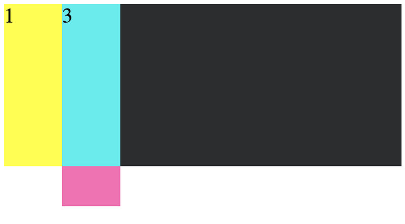
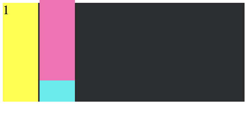
- Absolute elements are removed from the normal page flow and other elements around it act like it's not there. (how we can easily achieve some layering)
- Here are some examples to illustration absolute positioning:
.container {
  background-color: #2b2d2f;
  position: relative;
}#pink-box {
  position: absolute;
  top: 60px;
}
.container {
  background-color: #2b2d2f;
  position: relative;
}#pink-box {
  position: absolute;
  top: 60px;
}#blue-box {
  position: absolute;
}
.container {
  background-color: #2b2d2f;
  position: relative;
}#pink-box {
  background-color: #ff69b4;
  bottom: 60px;
  position: absolute;
}
.container {
  background-color: #2b2d2f;
}#pink-box {
  background-color: #ff69b4;
  bottom: 60px;
  position: absolute;
}

Fixed Positioning
- Another positioning that removes it's element from the page flow, and automatically positions it's parent as the HTML doc itself.
- Fixed also uses top, right, bottom, and left.
- Useful for things like nav bars or other features we want to keep visible as the user scrolls.
Sticky Positioning
- Remains in it's original position in the page flow, and it is positioned relative to it's closest block-level ancestor and any scrolling ancestors.
- Behaves like a relatively positioned element until the point at which you would normally scroll past it's viewport — then it sticks!
- It is positioned with top, right, bottom, and left.
- A good example are headers in a scrollable list.

Flexible Box Model
- Flexbox is a CSS module that provides a convenient way for us to display items inside a flexible container so that the layout is responsive.
- Float was used back in the day to display position of elements in a container.
- A very inconvenient aspect of float is the need to clear the float.
- To 'clear' a float we need to set up a ghost div to properly align — this is already sounds so inefficient.
Using Flexbox
- Flexbox automatically resizes a container element to fit the viewport size without needing to use breakpoints.

.container {
  display: flex; /*sets display to use flex*/
  flex-wrap: wrap; /*bc flex tries to fit everything into one line, use wrap to have the elements wrap to the next line*/
  flex-direction: row; /*lets us create either rows or columns*/
}flex-flowcan be used to combine wrap and direction.justify-contentused to define the alignment of flex items along the main axis.align-itemsused to define the alignment on the Y-axis.align-contentredistributes extra space on the cross axis.- By default, flex items will appear in the order they are added to the DOM, but we can use the
orderproperty to change that. - Some other properties we can use on flex items are:
flex-grow: dictates amount of avail. space the item should take up.flex-shrink: defines the ability for a flex item to shrink.flex-basis: Default size of an element before the remaining space is distributed.flex: shorthand for grow, shrink and basis.align-self: Overrides default alignment in the container.
Grid Layout
- CSS Grid is a 2d layout system that let's use create a grid with columns and rows purely using Vanilla CSS. (flex is one dimensional)
Bootstrap vs CSS Grid
- Bootstrap was a front-end library commonly used to create grid layouts but now CSS grid provides greater flexibility and control.
- Grid applies style to a parent container and it's child elements.
.grid-container {
  display: grid;
  grid-template-columns: repeat(3, 1fr);
  grid-template-rows: auto;
  grid-template-areas:
    "header header header"
    "main . sidebar"
    "footer footer footer";  grid-column-gap: 20px;
  grid-row-gap: 30px;
  justify-items: stretch;
  align-items: stretch;
  justify-content: stretch;
  align-content: stretch;
}.item-1 {
  grid-area: header;
}
.item-2 {
  grid-area: main;
}
.item-3 {
  grid-area: sidebar;
}
.item-4 {
  grid-area: footer;
}- Columns and Rows can be defined with: pixels, percentages, auto, named grid lines, using
repeat, fractions. Grid Template Areasgives us a handy way to map out and visualize areas of the grid layout.- Combine areas with templates to define how much space an area should take up.
Grid Gapscan be used to create 'gutters' between grid item.s- The way we have defined our grid with
grid-templatesandareasare considered explicit. - We can also
implicitlydefine grids.
.grid-container {
  display: grid;
  grid-template-columns: 100px 100px 100px 100px;
  grid-template-rows: 50px 50px 50px;
  grid-auto-columns: 100px;
  grid-auto-rows: 50px;
}- Any grid items that aren't explicity placed are automatically placed or re-flowed
Spanning Columns & Rows
- We can use the following properties to take up a specified num of cols and rows.
grid-column-startgrid-column-endgrid-row-startgrid-row-end- All four properties can take any of the following values: the line number, span #, span name, auto.
.item-1 {
  grid-row-start: row2-start; /* Item starts at row line named "row2-start" */
  grid-row-end: 5; /* Item ends at row line 5 */
  grid-column-start: 1; /* Item starts at column line 1 */
  grid-column-end: three; /* Item ends at column line named "three" */
}.item-2 {
  grid-row-start: 1; /* Item starts at row line 1 */
  grid-row-end: span 2; /* Item spans two rows and ends at row line 3 */
  grid-column-start: 3; /* Item starts at column line 3 */
  grid-column-end: span col5-start; /* Item spans and ends at line named "col5-start" */
}
Grid Areas
- We use the grid areas in conjunction with grid-container property to define sections of the layout.
- We can then assign named sections to individual element's css rules.
Justify & Align Self
- Justify items and Align Items can be used to align all grid items at once.
- Justify Self is used to align self on the row.
- It can take four values: start, end, center, stretch.
- Align Self is used to align self on the column.
- It can take four values: start, end, center, stretch.
CSS Hover Effect and Handling
Overflow
css .btn { background-color: #00bfff; color: #ffffff; border-radius: 10px; padding: 1.5rem; }
.btn--active:hover { cursor: pointer; transform: translateY(-0.25rem);
/* Moves our button up/down on the Y axis */ }
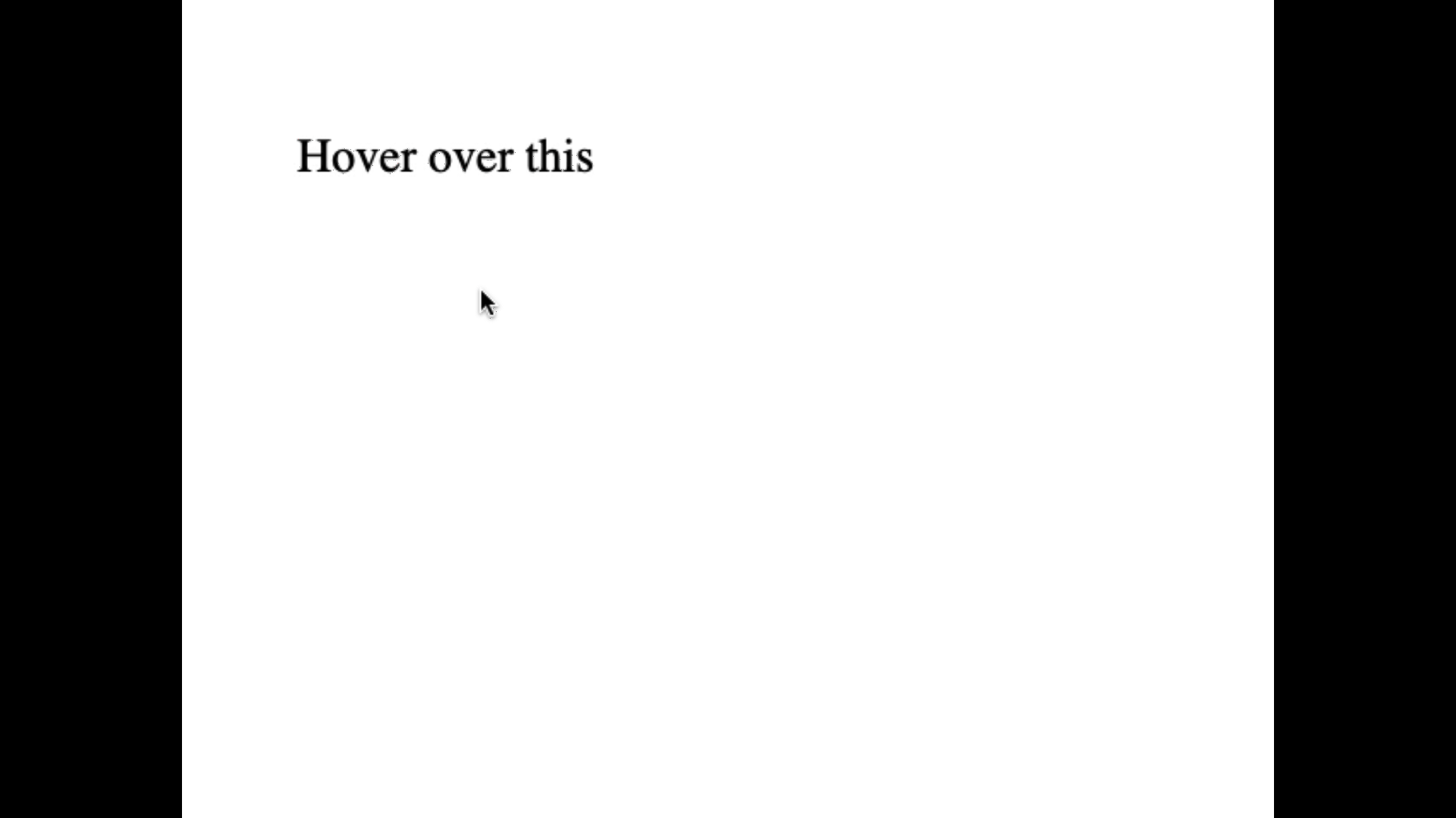
The Pseudo Class Selector hover activates when the cursor goes over the selected element.
Content Overflow- You can apply an overflow content property to an element if it's inner contents are spilling over.
There are three members in the overflow family: — overflow-x : Apply horizontally. - overflow-y : Apply vertically. - overflow : Apply both directions.
Transitions
- Transitions provide a way to control animation speed when changing CSS properties.
- Implicit Transitions : Animations that involve transitioning between two states.
Defining Transitions
transition-property: specifies the name of the CSS property to apply the transition.transition-duration: during of the transition.transition-delay: time before the transition should start.
Examples :
#delay {
  font-size: 14px;
  transition-property: font-size;
  transition-duration: 4s;
  transition-delay: 2s;
}#delay:hover {
  font-size: 36px;
}
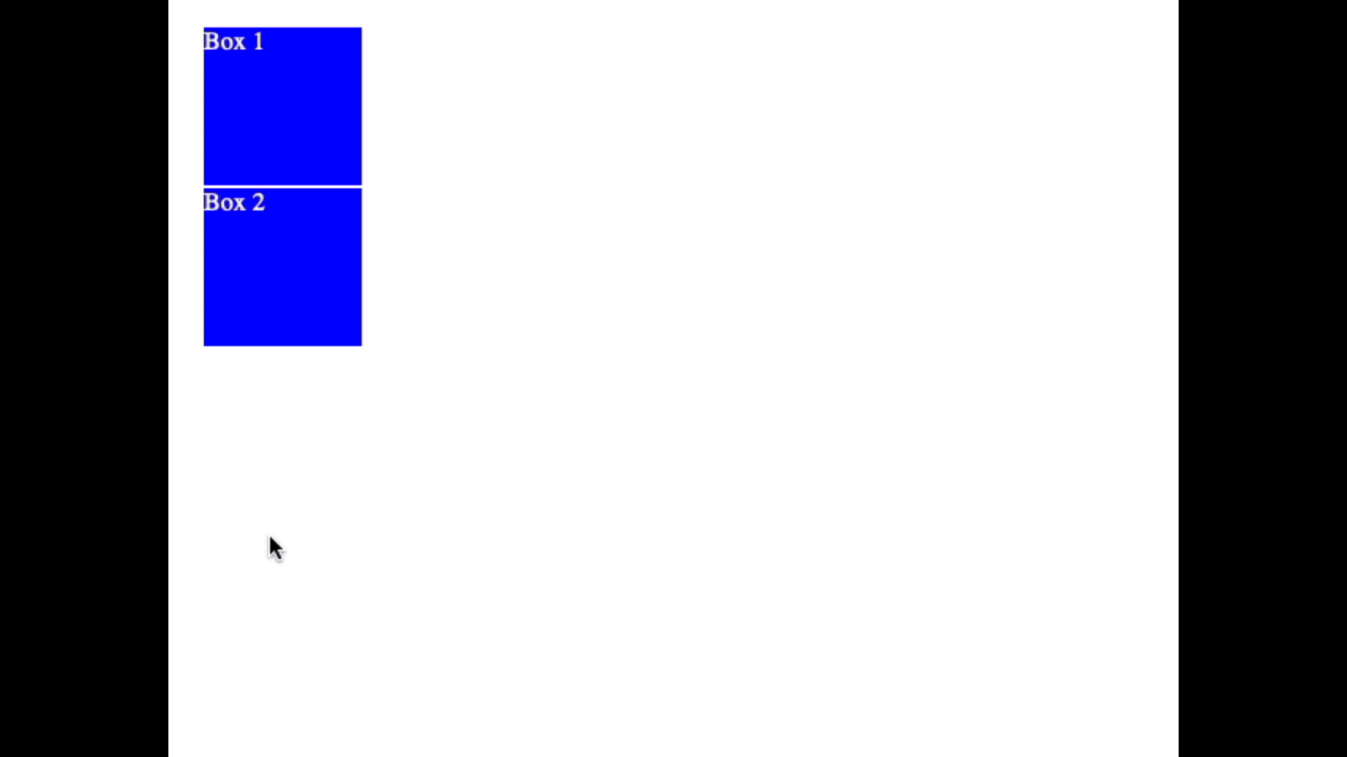
.box {
  border-style: solid;
  border-width: 1px;
  display: block;
  width: 100px;
  height: 100px;
  background-color: #0000ff;
  transition: width 2s, height 2s, background-color 2s, transform 2s;
}.box:hover {
  background-color: #ffcccc;
  width: 200px;
  height: 200px;
  transform: rotate(180deg);
}
BEM Guidelines
- BEM was created as a guideline to solve the issue of loose standards around CSS naming conventions.
- BEM stands for
block,element,modifier. - Block
- A standalone entity that is meaningful on it's own.
- Can be nested and interact with one another.
- Holistic entities without DOM rep can be blocks.
- May consist latin letters, digits, and dashes.
- Any DOM node can be a block if it accepts a class name.
- Element
- Part of a block and has no standalone meaning.
- Any element that is semantically tied to a block.
- May consist latin letters, digits, and dashes.
- Formed by using two underscores after it's block name.
- Any DOM node within a block can be an element.
- Element classes should be used independently.
- Modifier
- A flag on blocks or elements. Use them to change appearance, behavior or state.
- Extra class name to add onto blocks or elements.
- Add mods only to the elements they modify.
- Modifier names may consist of Latin letters, digits, dashes and underscores.
- Written with two dashes.
BEM Example
<form class="form form--theme-xmas form--simple">
  <input class="form__input" type="text" />
  <input class="form__submit form__submit--disabled" type="submit" />
</form>/* block selector */
.form {
}/* block modifier selector */
.form--theme-xmas {
}/* block modifier selector */
.form--simple {
}/* element selector */
.form__input {
}/* element selector */
.form__submit {
}/* element modifier selector */
.form__submit--disabled {
}
If you found this guide helpful feel free to checkout my github/gists where I host similar content:
bgoonz — OverviewWeb Developer, Electrical Engineer JavaScript | CSS | Bootstrap | Python | React | Node.js | Express | Sequelize…github.com
Or Checkout my personal Resource Site:
a/A-Student-ResourcesEdit descriptiongoofy-euclid-1cd736.netlify.app
By Bryan Guner on March 6, 2021.